New Templates, Easier Editing
Version 3.4 of Aeon Timeline focuses on visual and usability improvements, making it easier to see what matters and edit faster. But that’s not all—starting new files is now easier, with a range of templates, guides, and features designed to get you up and running quickly.
New Guides
We understand that staring at an empty timeline can feel daunting, so we’ve created guides to accompany some of the new templates. Each guide offers a variation on ways to work within the app—whether you prefer using the spreadsheet, the timeline, or the side panel. There are multiple ways to achieve the same result, and even the most experienced users might discover some new ideas.
New Template Selector
Whether you’re writing a story, preparing a legal case, studying ancient history, or compiling an incident log, we’ve got a template to help you get started.
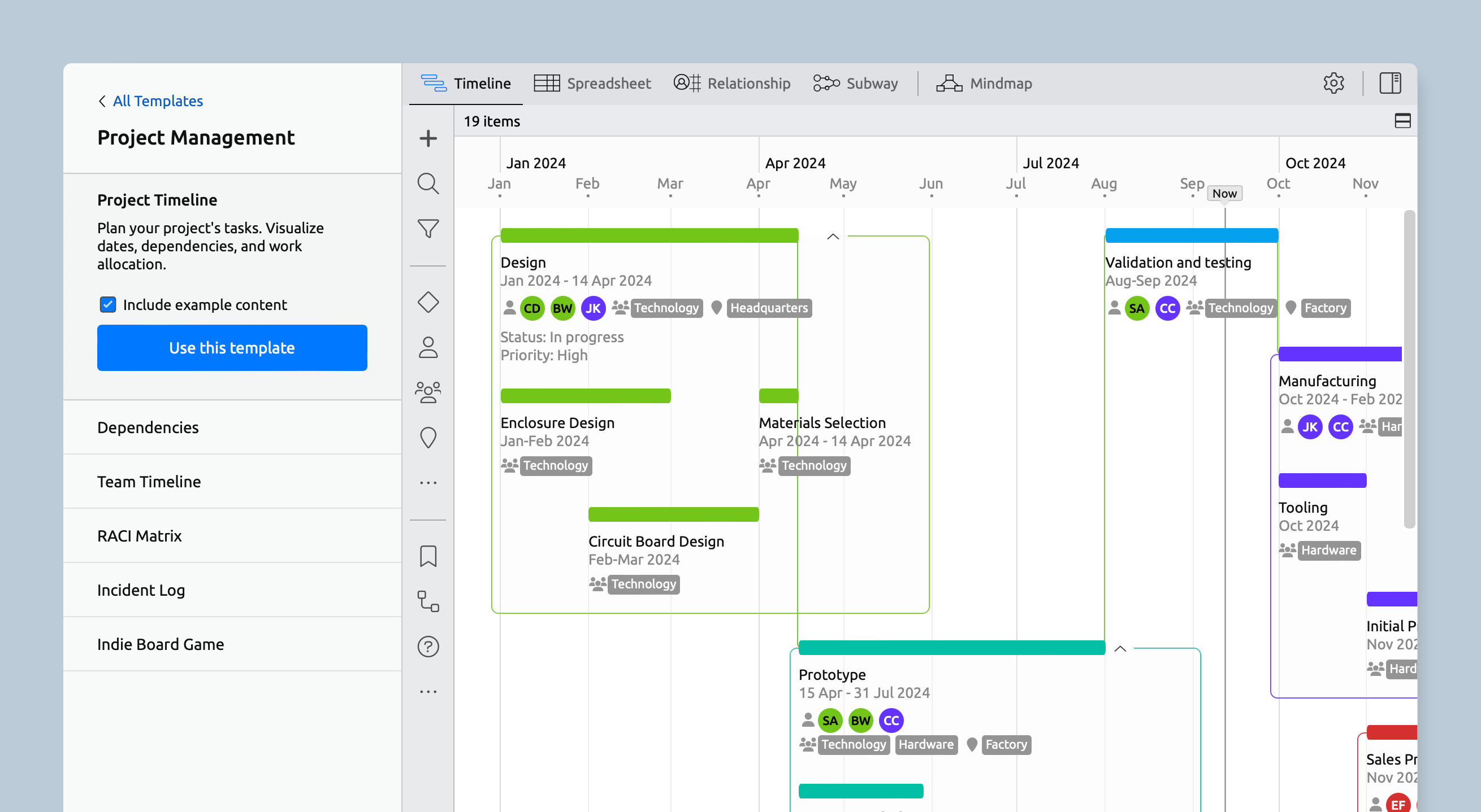
We’ve revamped the template selector to make choosing the right option easier when starting a new file. Now, you can test-drive any template to see how it works before making your final choice. Plus, you can keep the sample data as a helpful reference or start with a clean slate.
More Timeline Display Options
Tags and Properties on the Timeline
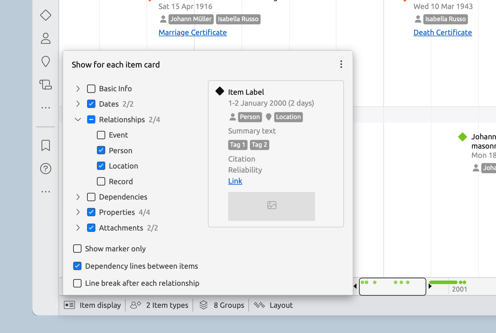
Tags, properties, and links can now be displayed on the timeline to give you more info at a glance. Just use the item display menu in the footer (which now has labels!) to choose what you want to see.
Collapsible Groups
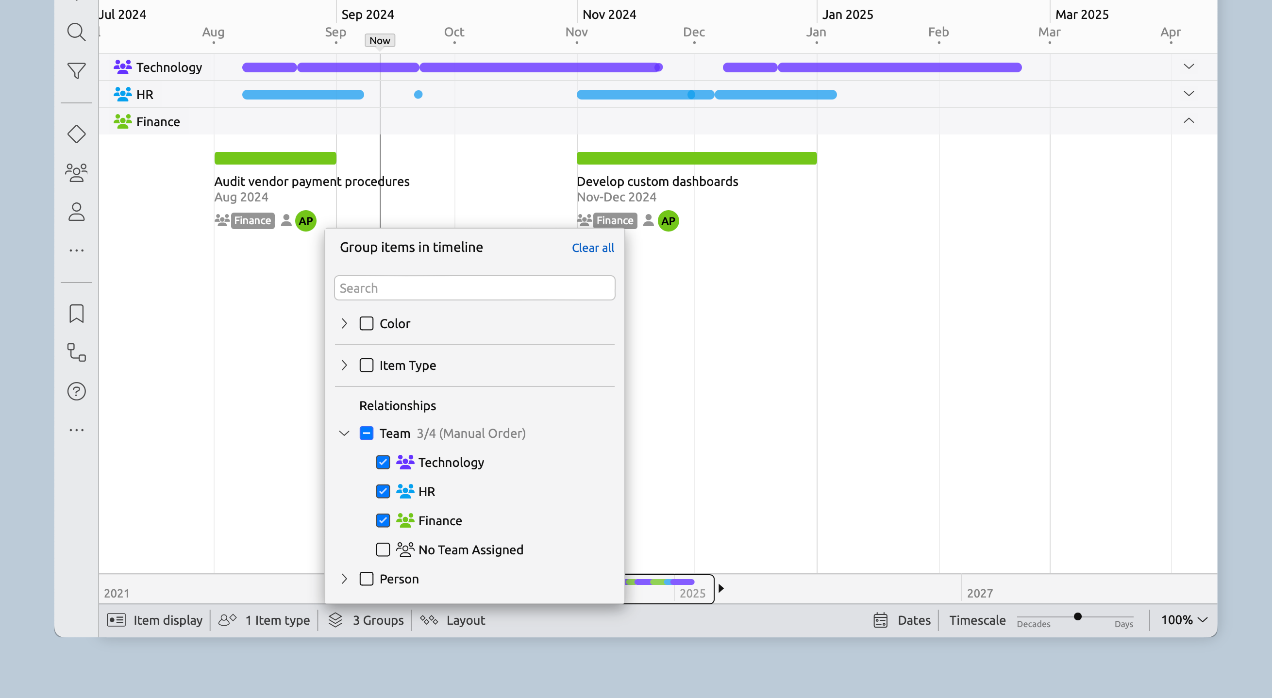
The Timeline view now allows grouping by color or item type, giving you more control over how your information is displayed.
Groups are now collapsible for a tidier view with less need for vertical scrolling. A handy roll-up display keeps items visible within collapsed groups, and new items can be created directly within a group by double-clicking. You can even drag items between groups to change their color or add them to another group.
Easier Editing
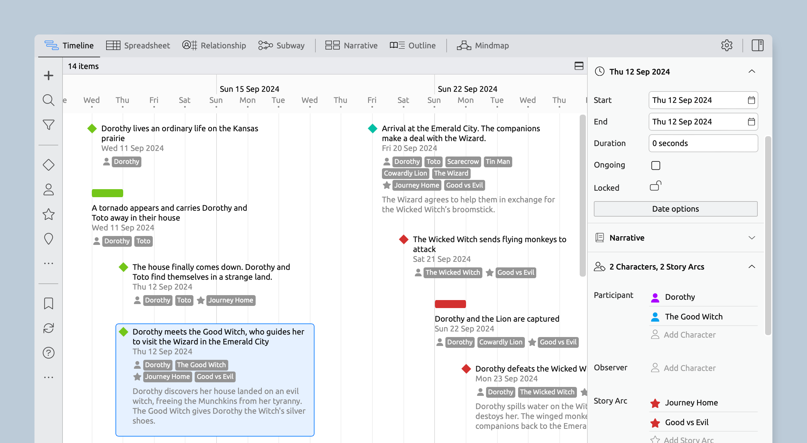
Edit Items In Place
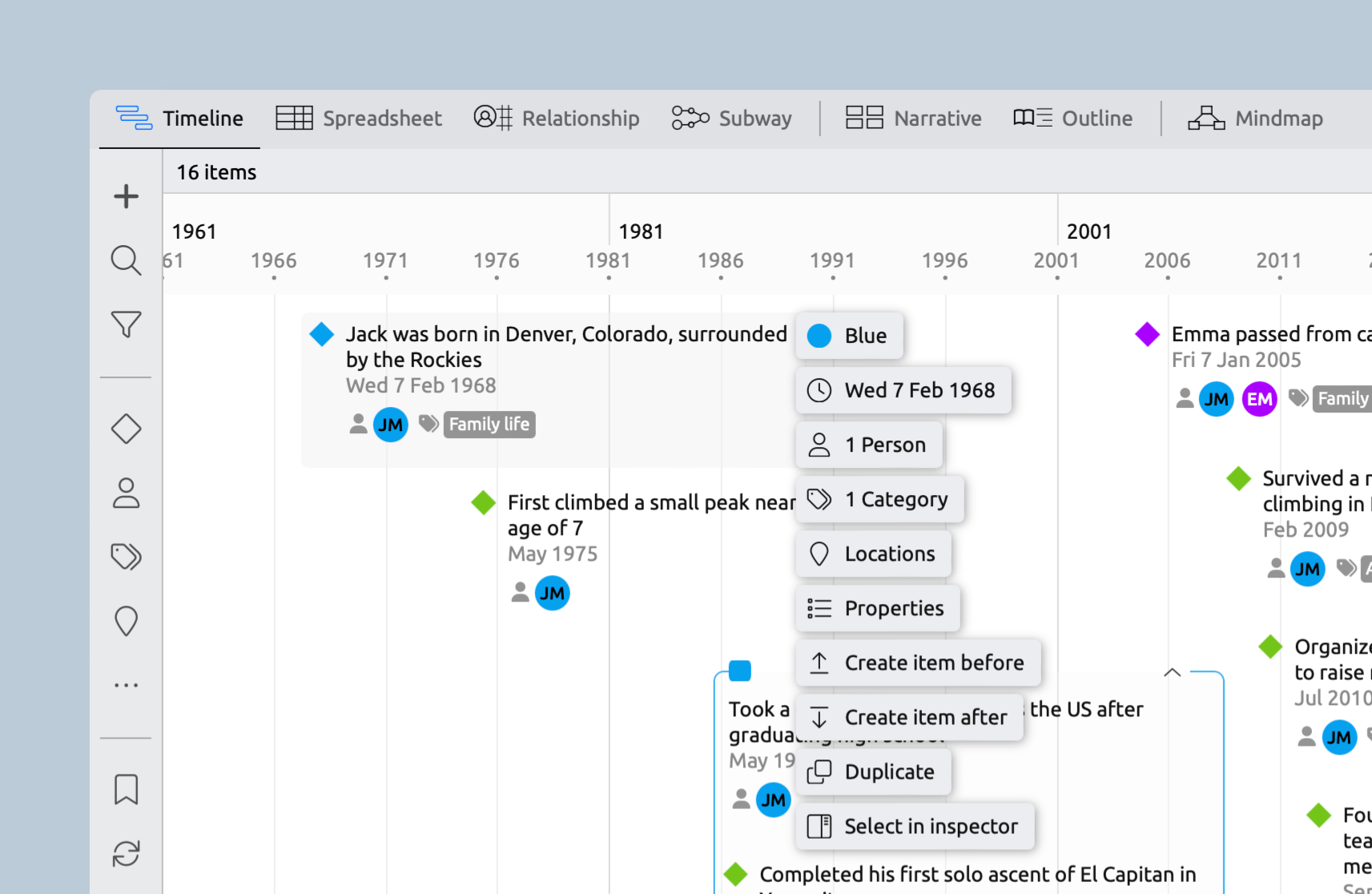
Use the new edit button to create duplicates or add new items right before or after existing ones. You can also edit items directly in place, minimizing clicks and cursor movement.
On iOS, you can also edit labels in place without opening the Inspector. Within the inspector, you can also edit most fields from the one screen, with less flipping between panels.
Collapsible Inspector Panels
The inspector now features collapsible panels instead of tabs. When a panel is collapsed, you'll see a summary of any data within, making it easier to find and edit your information.
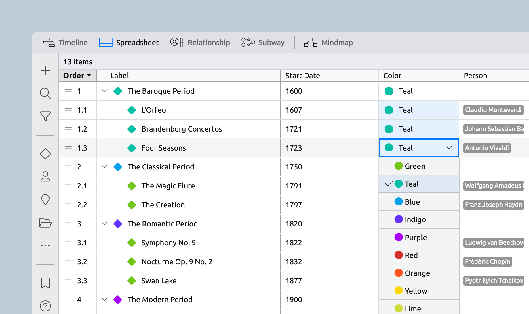
Multi-Cell Editing in the Spreadsheet
When you select multiple rows or cells in the spreadsheet, the changes you make from a dropdown will now apply to the entire selection. So if you choose three rows and change the color in one of them, all three items will be updated. The same goes for things like assigning a person to an event—the new option will be applied to all selected items.
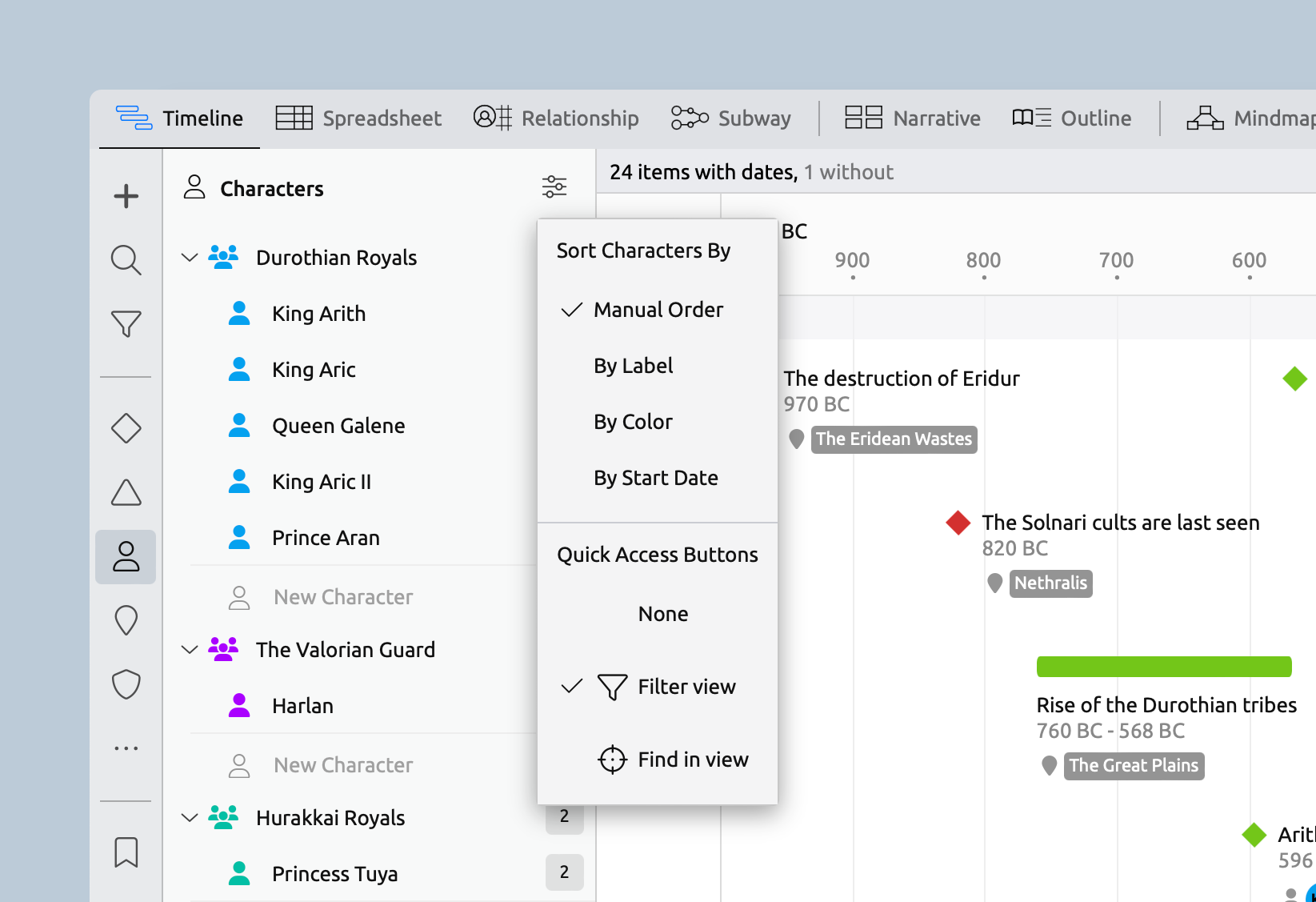
Quick Access Buttons
You can now choose between two different quick access buttons in the item panels.
Filter View shows a count of all the related items within the view, and lets you quickly filter the view to show those items only.
Find in View helps you quickly find and scroll to items within the view. For unplaced items, such as events without a date in the Timeline view, you can also easily add them to the view with just one click.
Easier Customization
Found a template that’s close, but not quite perfect? With the latest app update, customizing templates is easier than ever, and you can make most changes right from the side panel.
Edit Item Types In Place
The new edit menus let you update the name, icon, and default colors of item types to tailor them to your project, whether that’s matching company language, industry jargon, or simply personal preference.

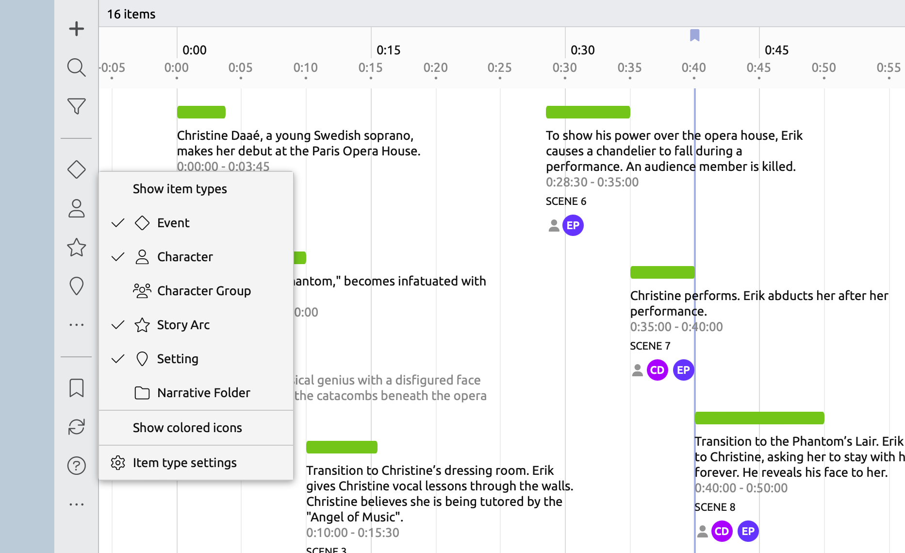
Show/Hide Icons in the Sidebar
You can now control the visibility of item types directly from the Sidebar, allowing you to show or hide selected item types to suit your needs.
Easy Duplication of Item Types
Item types can now be duplicated in settings, making customizing a template much easier. Just rename your copies, and you’re all set!

Visual Improvements
Better Alignment in the Spreadsheet
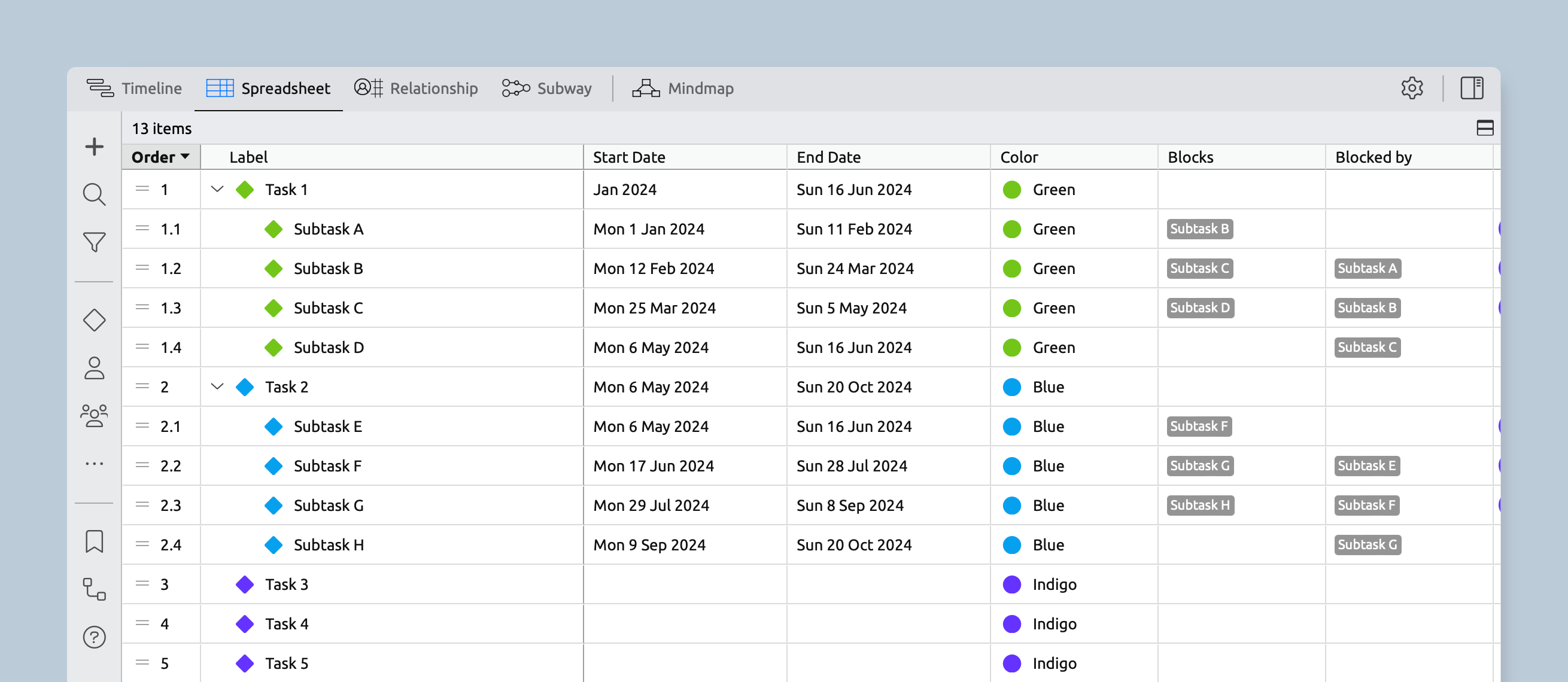
Parent and non-parent items in the Spreadsheet and Relationship views now have consistent indentation, so they align when some items contain nested children.
Tighter Spacing on the Timeline
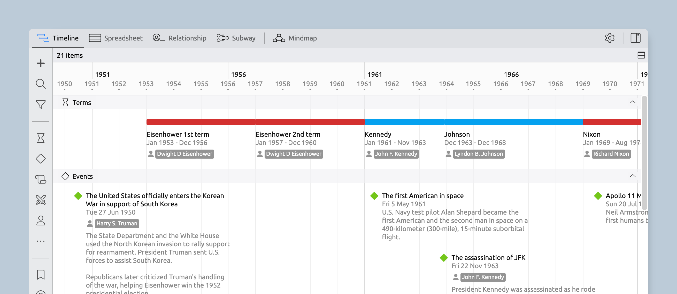
Items on the timeline have reduced their need for social distancing and are more likely to sit on the same line as other items instead of cascading downwards. To make this work, just set a duration for each item and ensure that there isn’t any overlapping text. It works best on longer events with short labels, especially when placed with similar items in their own group.
Better Display of Months on the Timeline
When the timescale is zoomed to show one-month intervals, the grid lines now indicate the start of each week for better contextual awareness of your events.

Bug Fixes
We’ve squished a few bugs here and there to make various improvements throughout the app. Check out the release notes for the full list.
Try Aeon Timeline free for 14 days
Get Aeon Timeline and easily visualize and organize your project.
